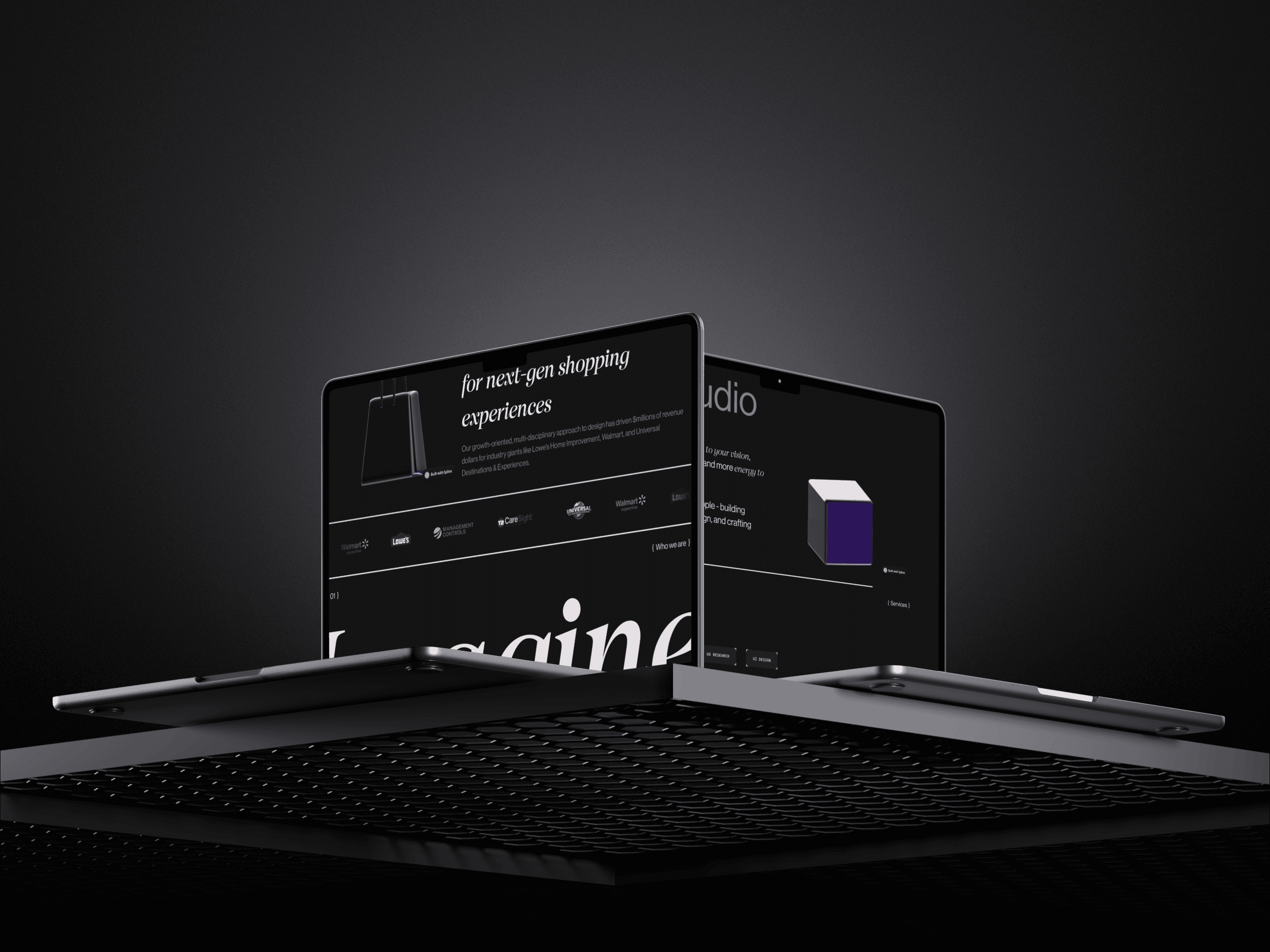
Helix
A boutique design studio specializing in UX, strategy, and research, partnering with major brands to deliver innovative, growth-driven solutions.
00 { Cover Image }
Challenge
Helix needed a website that would capture their innovative approach and showcase their expertise in UX design. As a studio partnered with major brands like Walmart, Lowe’s, and Universal Studios, the client required a sophisticated, interactive platform to present their case studies. The challenge was to create a site that not only highlights their work but also integrates advanced 3D models and animations, delivering a premium experience that matches their reputation.
Solution
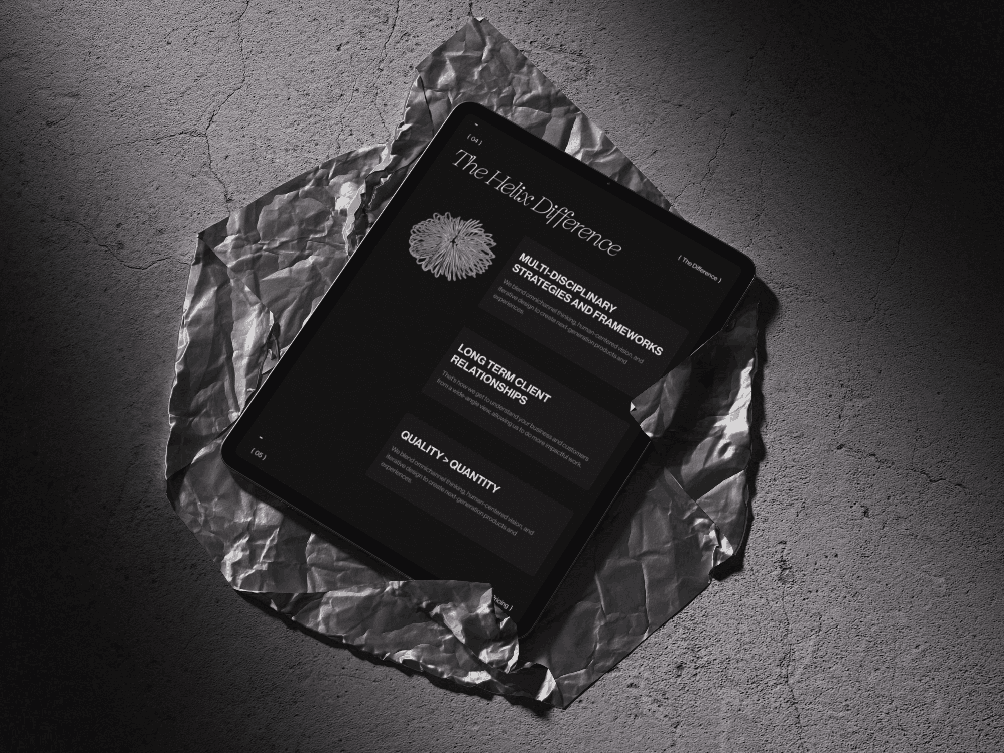
To meet Helix's needs, we developed a visually striking and highly interactive website using Framer, integrating 3D models and animations created in Spline and Rive. The website was designed to be a top-tier digital experience, showcasing Helix's portfolio and case studies in a way that reflects their expertise and creative capabilities. The final product is a polished, high-end website that effectively communicates the level of sophistication and innovation that Helix offers to its clients.
Overview
The Helix project focused on building a high-end website that showcases the studio’s cutting-edge UX design portfolio. Using Framer, the site incorporates 3D models and animations created in Spline and Rive. The minimalistic design puts the spotlight on Helix’s services and case studies, offering a sleek, polished platform that effectively represents the studio's expertise.
Research & Design
The project began with an in-depth analysis of leading UX design studios and their online presence to identify key trends and best practices. This research focused on understanding how top studios present their portfolios and case studies, particularly those working with high-profile clients. The goal was to create a website for Helix that not only showcases their work but also sets them apart in a competitive market.
Design Vision & Strategy
The design strategy centered around creating a visually immersive experience that aligns with Helix’s high-end clientele. We prioritized the integration of interactive 3D models and animations to elevate the site’s creativity and engagement. The layout was designed to be minimalistic, ensuring that the content—such as case studies, client logos, and project highlights—remains the focal point.
Design Execution in Figma
The design process began in Figma, where we meticulously crafted the site's structure and visual elements. Each component was designed with the placement of 3D elements and interactive features in mind. Figma allowed for detailed planning and collaboration, ensuring that the final design would seamlessly integrate all visual and interactive elements, providing a polished and immersive user experience.
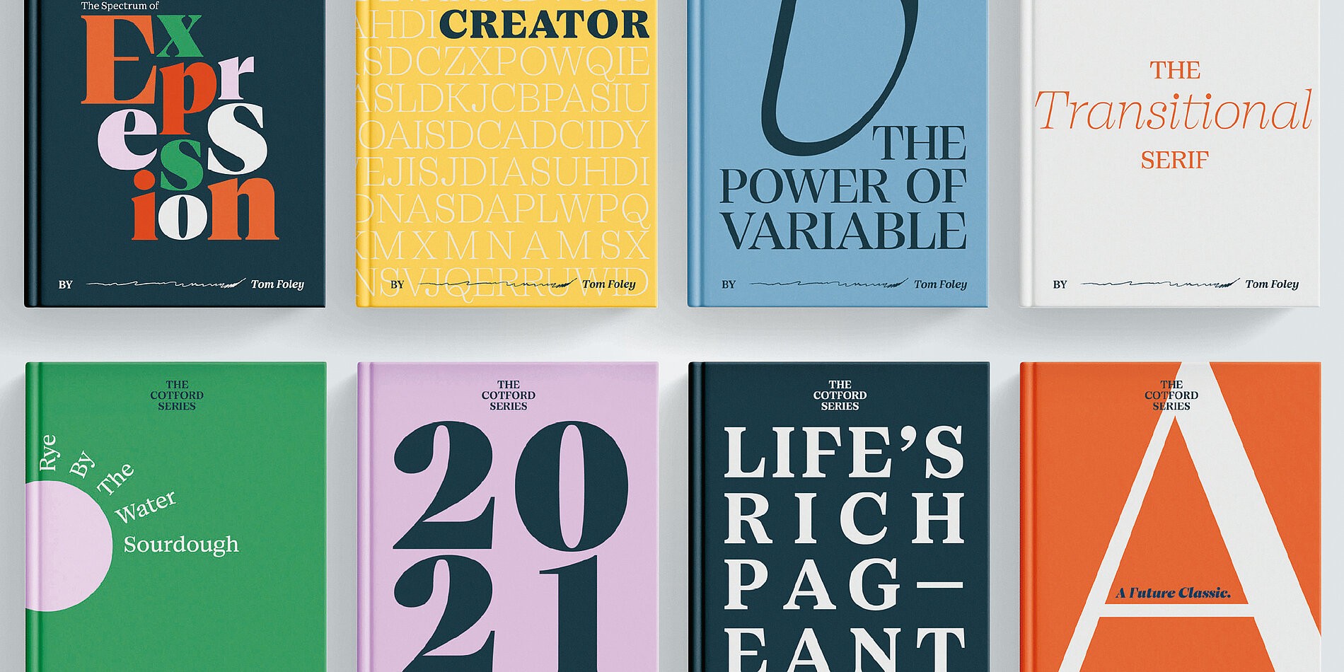
Typefaces | Cotford, Neue Haas Grotesk™
Cotford and Neue Haas Grotesk™ were chosen to reflect Helix’s modern and sophisticated brand identity. Cotford adds a touch of elegance and personality, while Neue Haas Grotesk™ offers clean, precise lines that enhance readability.
Development Process
The development process for Helix began with detailed planning and alignment with the design vision. The primary goal was to translate the sleek, minimalistic design into a fully functional website that would showcase Helix’s portfolio in an engaging and interactive manner. The integration of 3D elements required careful consideration to ensure they would perform seamlessly across all devices.
Building the Experience
Using Framer, the website was built to be both highly interactive and visually polished. Custom 3D models and animations were incorporated, with a focus on smooth transitions and responsive design. Each section of the site was meticulously crafted to ensure that the visual elements complemented the overall user experience.
Testing & Refinement
Throughout the development, rigorous testing was conducted to ensure optimal performance and a seamless user experience. Multiple rounds of feedback were gathered to refine the interactions and design details. Special attention was given to cross-browser compatibility and responsiveness to maintain the integrity of the design across all platforms.
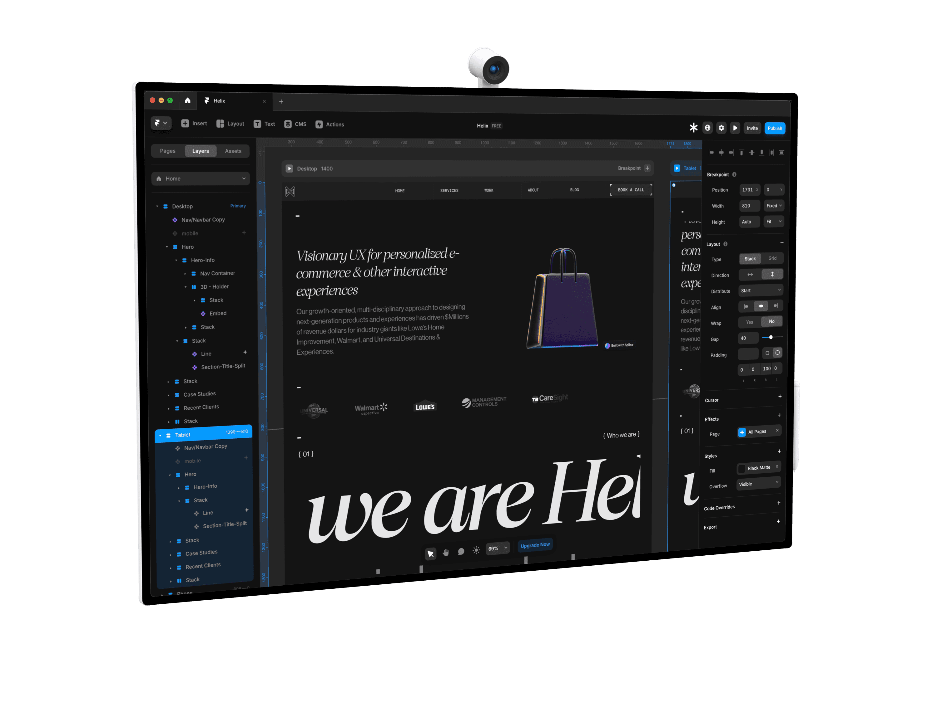
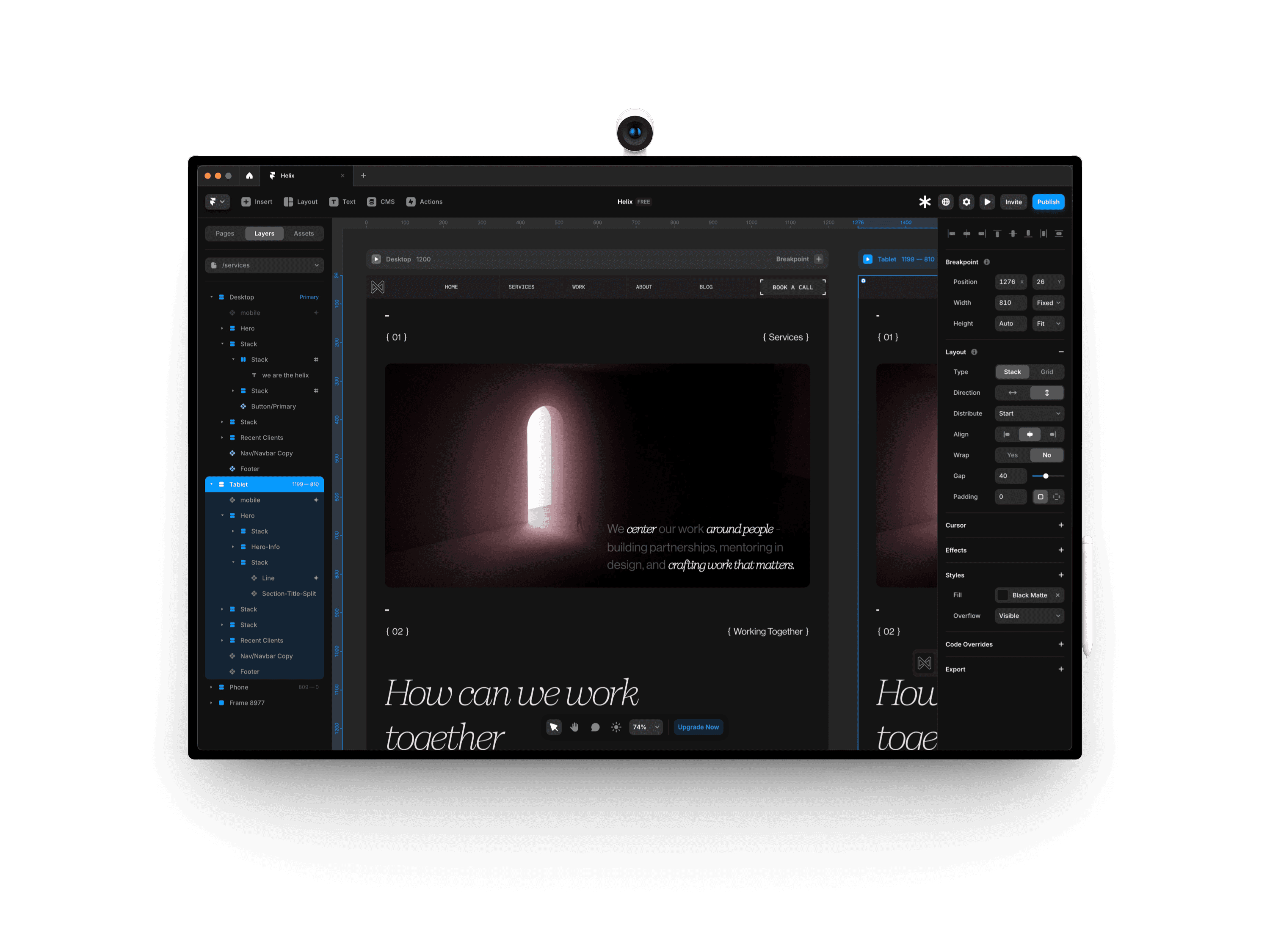
Framer Project Overview
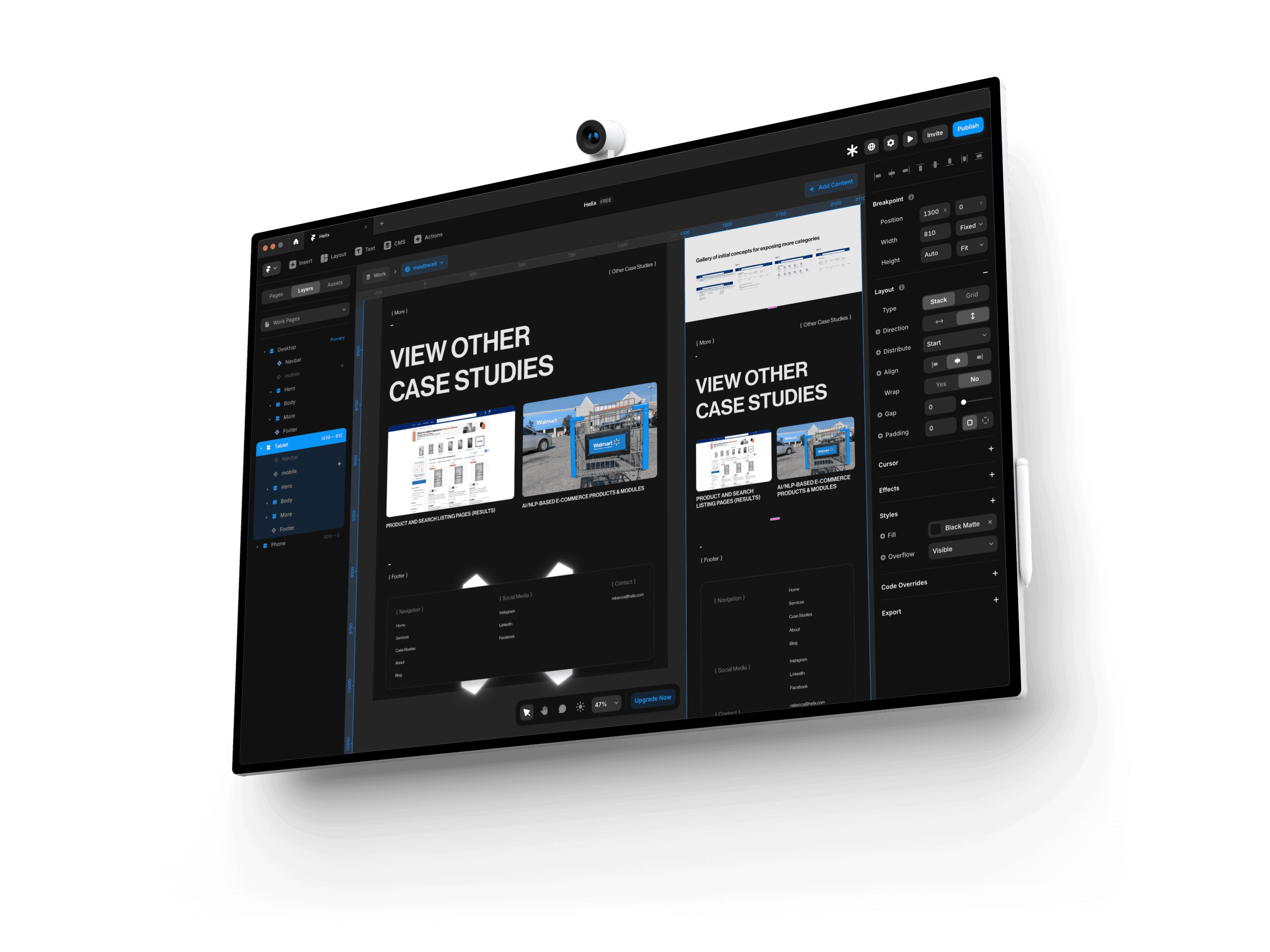
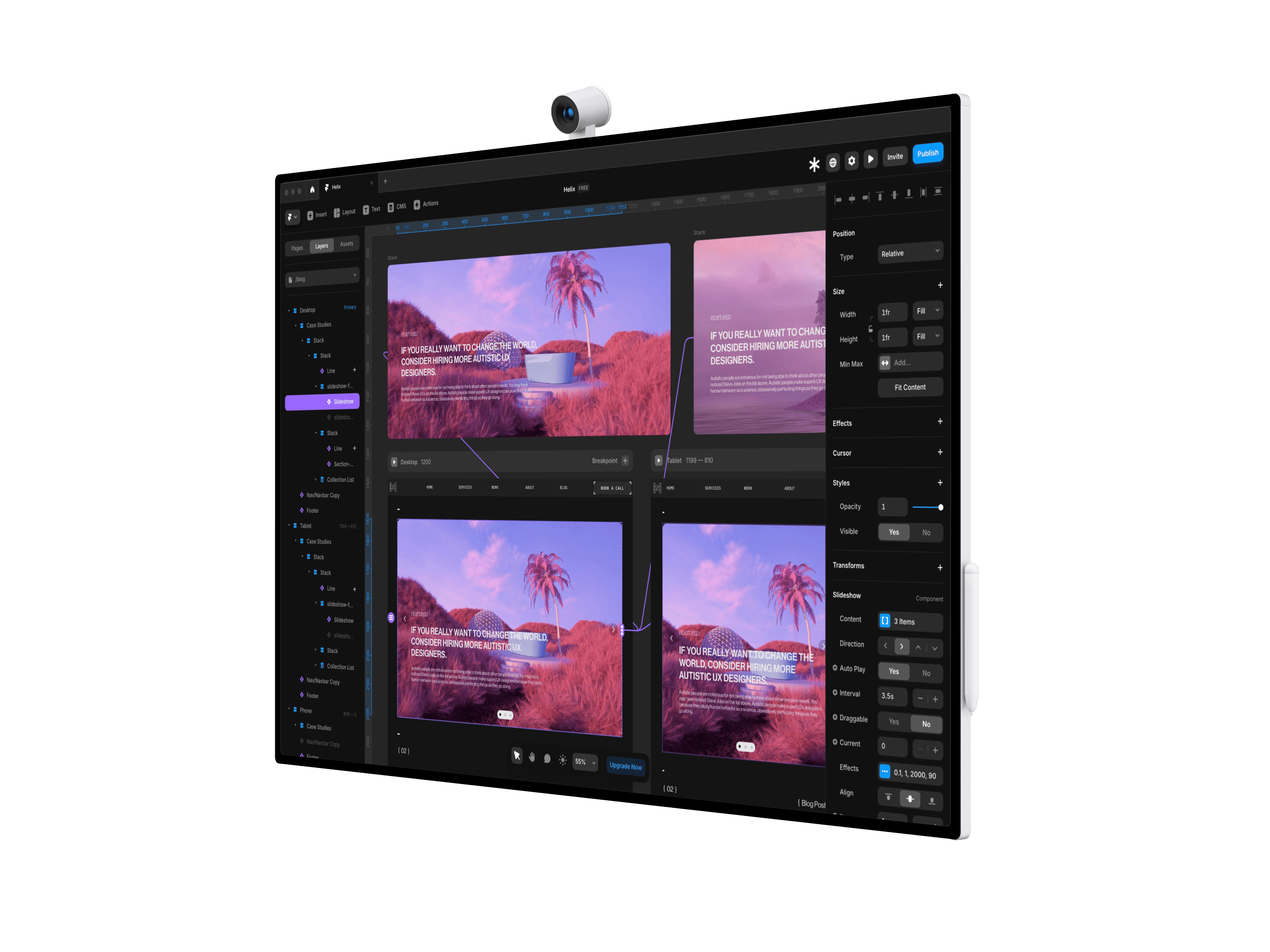
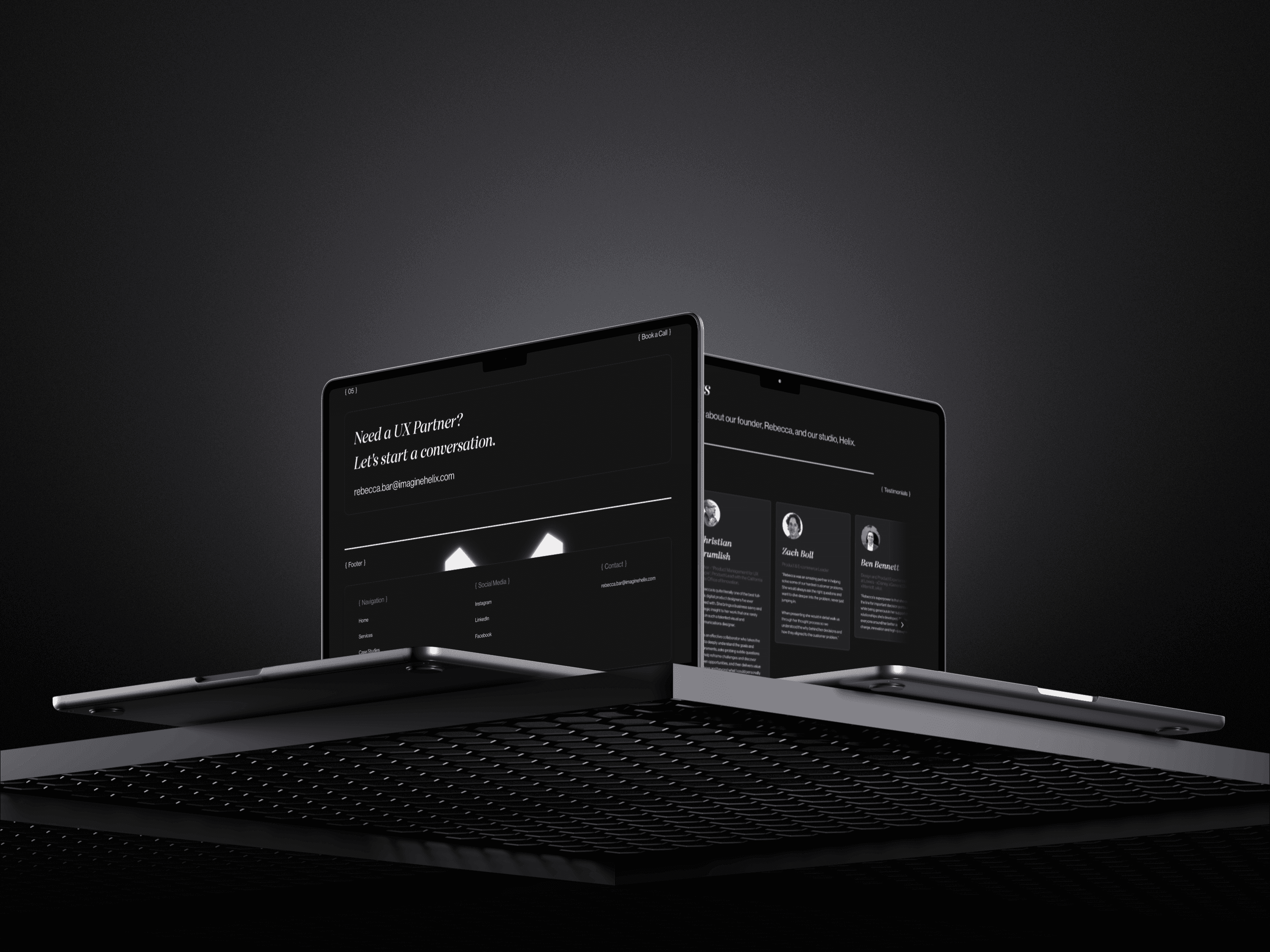
Below are some screenshots from our Framer project, showcasing the pages, breakpoints, smart components, interactive elements, and code overrides we developed for this site.
Prototypes |
Visual Presentation
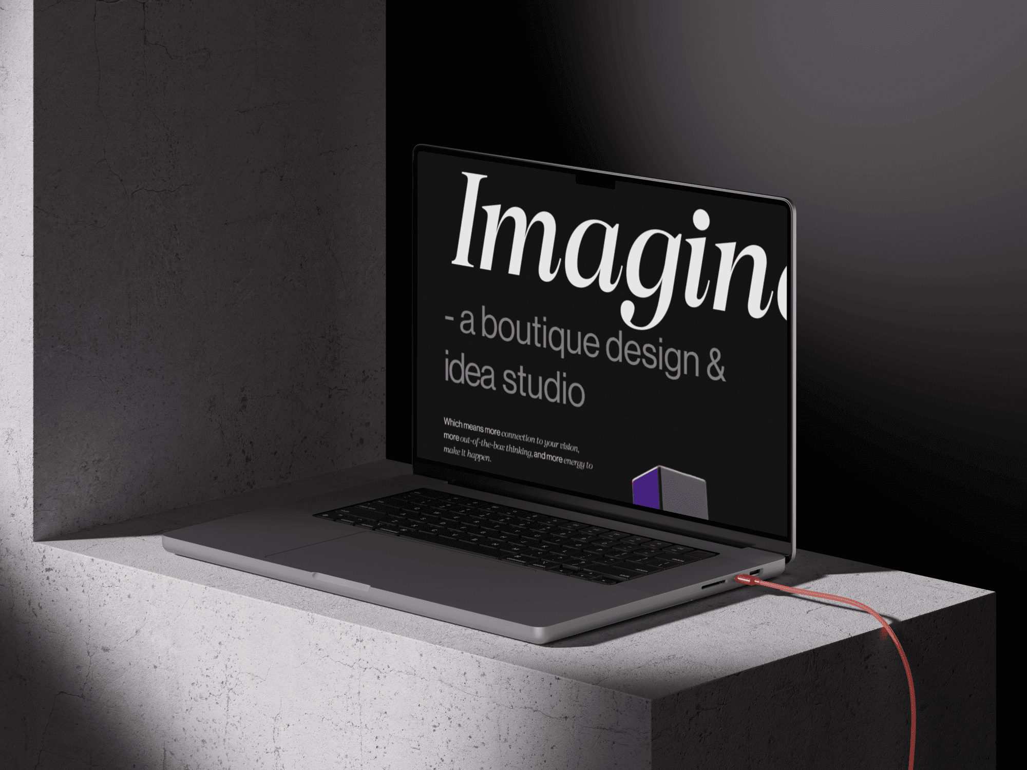
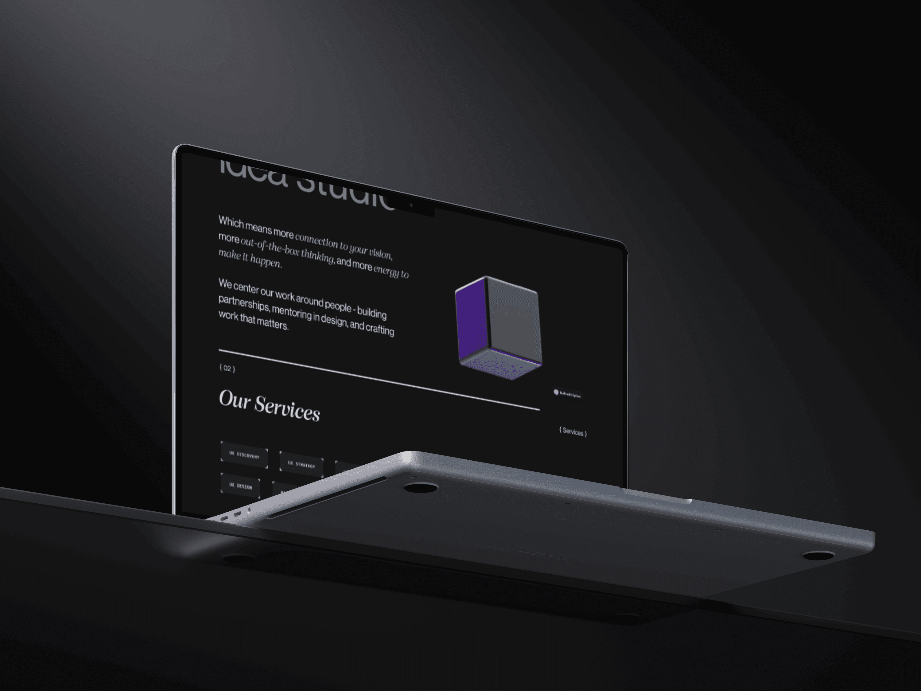
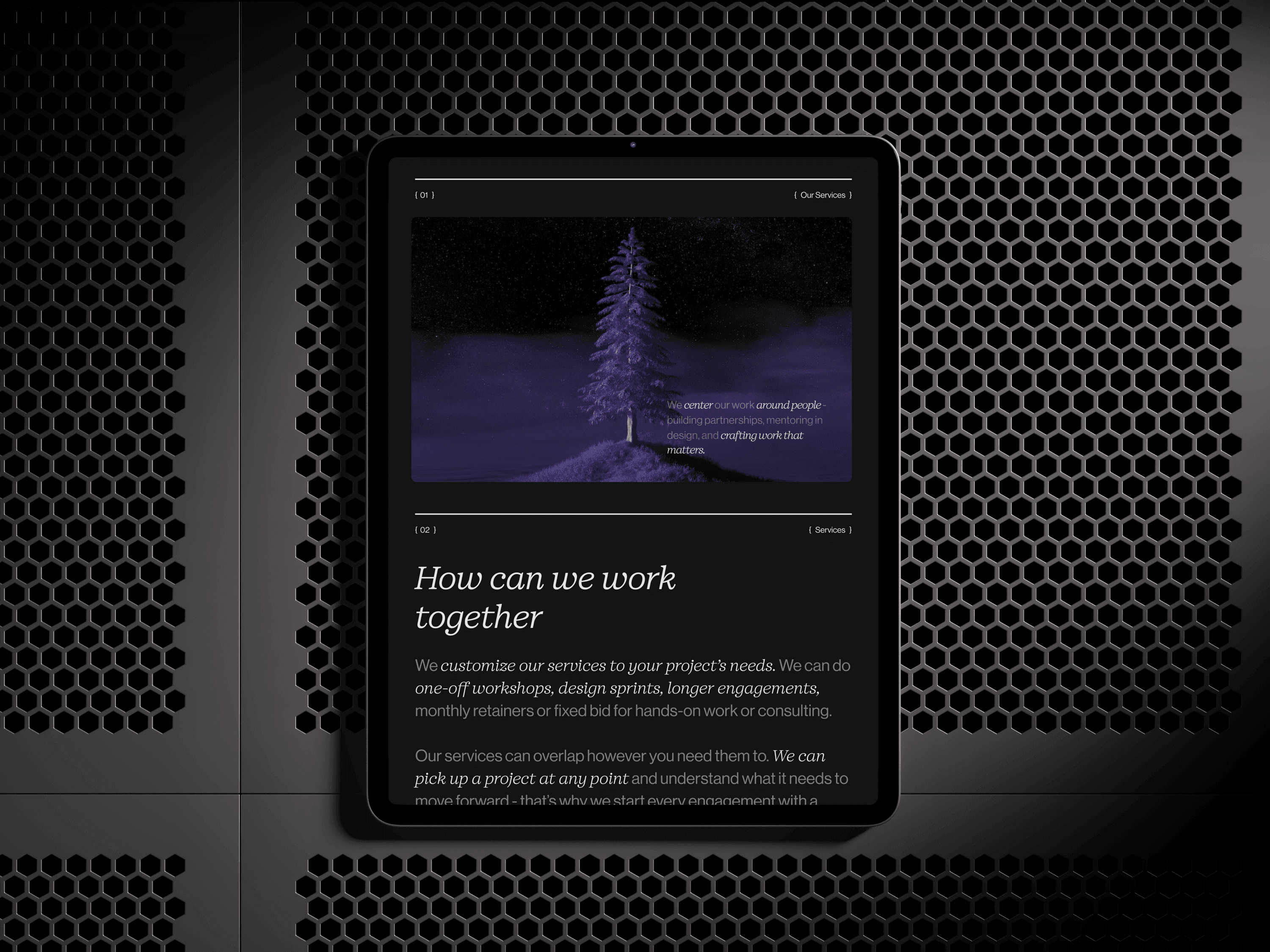
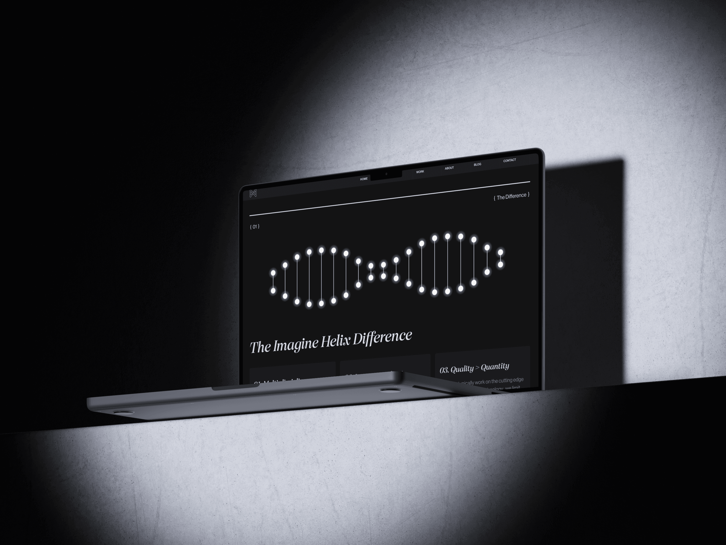
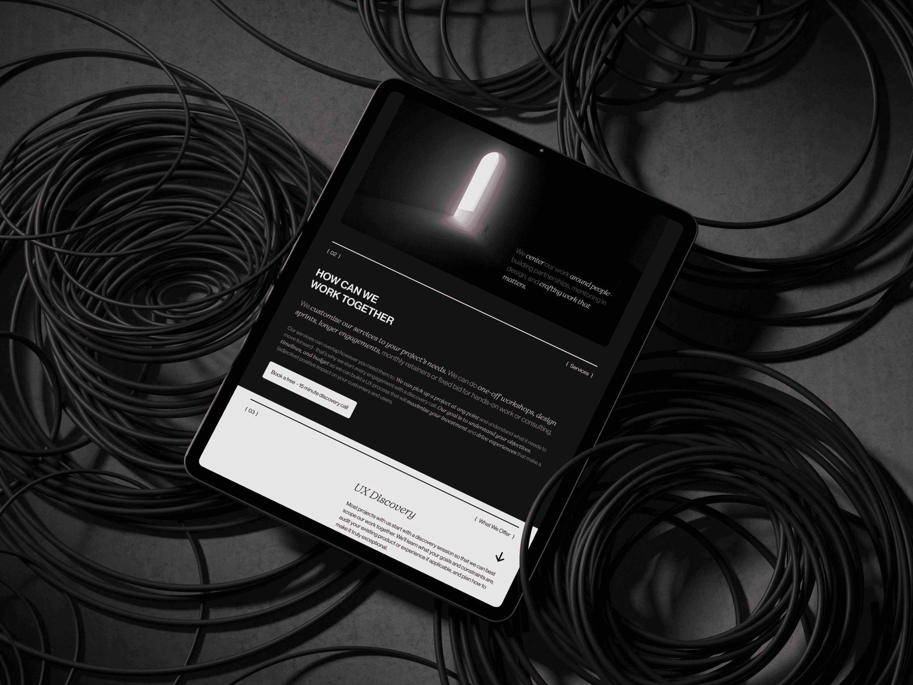
Below is a visual presentation, featuring images and videos that highlight the design, interactive elements, and overall functionality of Helix's website.
01 { Video }
02 { Image }
03 { Image }
04 { Image }
05 { Image }
06 { Video }
07 { Image }
08 { Image }
09 { Image }
10 { Image }
11 { Image }
12 { Image }
Final Solution
The Helix website is a sleek, sophisticated platform that effectively showcases the studio's UX design expertise. The site integrates custom 3D models and animations to create an engaging user experience. Its minimalistic design ensures that the portfolio and case studies are the primary focus, reflecting Helix’s innovative and high-end approach.
Key Features
Custom 3D Models & Animations: Integrated seamlessly to enhance user interaction and visual appeal.
Minimalistic Design: Ensures that Helix's work takes center stage without distractions.
Responsive Layout: Optimized for performance across all devices, maintaining a consistent user experience.
Immersive Visuals: Engaging visual content that enhances the user experience and elevates the presentation of Helix's work.
Results & Impact
The website was highly praised for its sleek design and innovative integration of 3D elements. It was recognized as a strong representation of Helix’s expertise and creativity. The design’s attention to detail and seamless user experience were frequently highlighted as standout features.
Since the launch, Helix has seen a noticeable increase in user engagement, with more time spent exploring case studies and portfolio pieces. This enhanced visibility has not only strengthened their existing client relationships but also attracted new business opportunities. The website solidifies Helix’s position as a leader in UX design, making a strong impression on potential clients and partners.
{ Other projects }
